Description
At Net2Phone, I created unique, eye-catching advertisements and direct marketing pieces that appealed to a wide range of markets on an emotional and practical level.
Roles
Graphic Designer
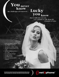
A classic serif font paired with black-and-white photography were utilized to achieve a classic, traditional look for the three print advertisements above. Two large, graphic elements — parenthesis and visceral markings — were utilized to make these ads stand out. Each ad’s content is encapsulated in parenthesis to make the ad graphically and grammatically appear as an aside or a tip. The visceral markings add movement and relate directly to the events in each background image.


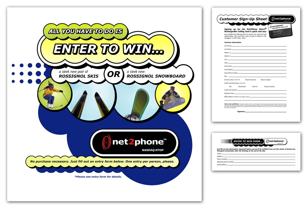
Ski For Free
This experiential recruiting campaign appeared at ski resorts in the northeast in the winter of 2001. Using vintage Las Vegas signage as inspiration, this energetic typographic treatment, with its overlapping circles and bright colors, commanded attention and made this promotion a huge success. Marketing materials included a large banner display, tabletop flyer, and a signup/entry form.

This reversible hanging wall display appeared in college bookstores in 2001 and held calling card applications. One side targeted students in the United States, while the other appealed to students studying abroad. A colorful, eclectic mix of shape, line, stock photography, and three dimensional type treatments combine to form an engaging, legible display that collected many new customers.

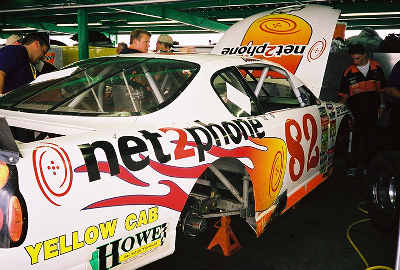
NASCAR Graphics
Net2Phone’s sponsorship of a NASCAR driver prompted the need for a racing variation of their existing logo. Tilting the Net2Phone’s existing icon created a reference to a wheel in motion. Dubbed the ‘flaming swoosh,’ this symbol was used on polos, t-shirts, and car decals.

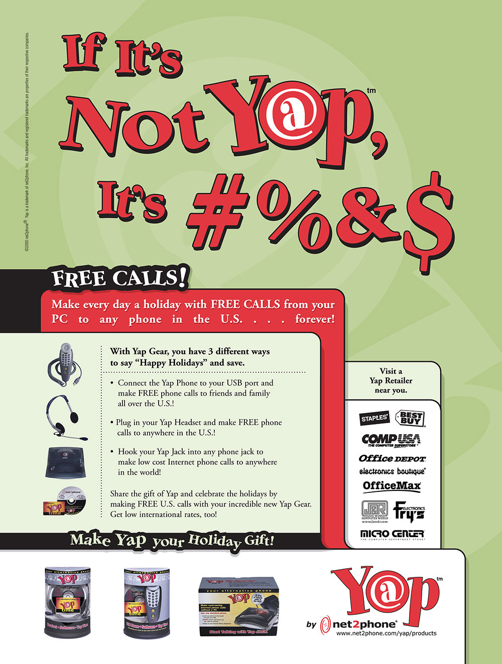
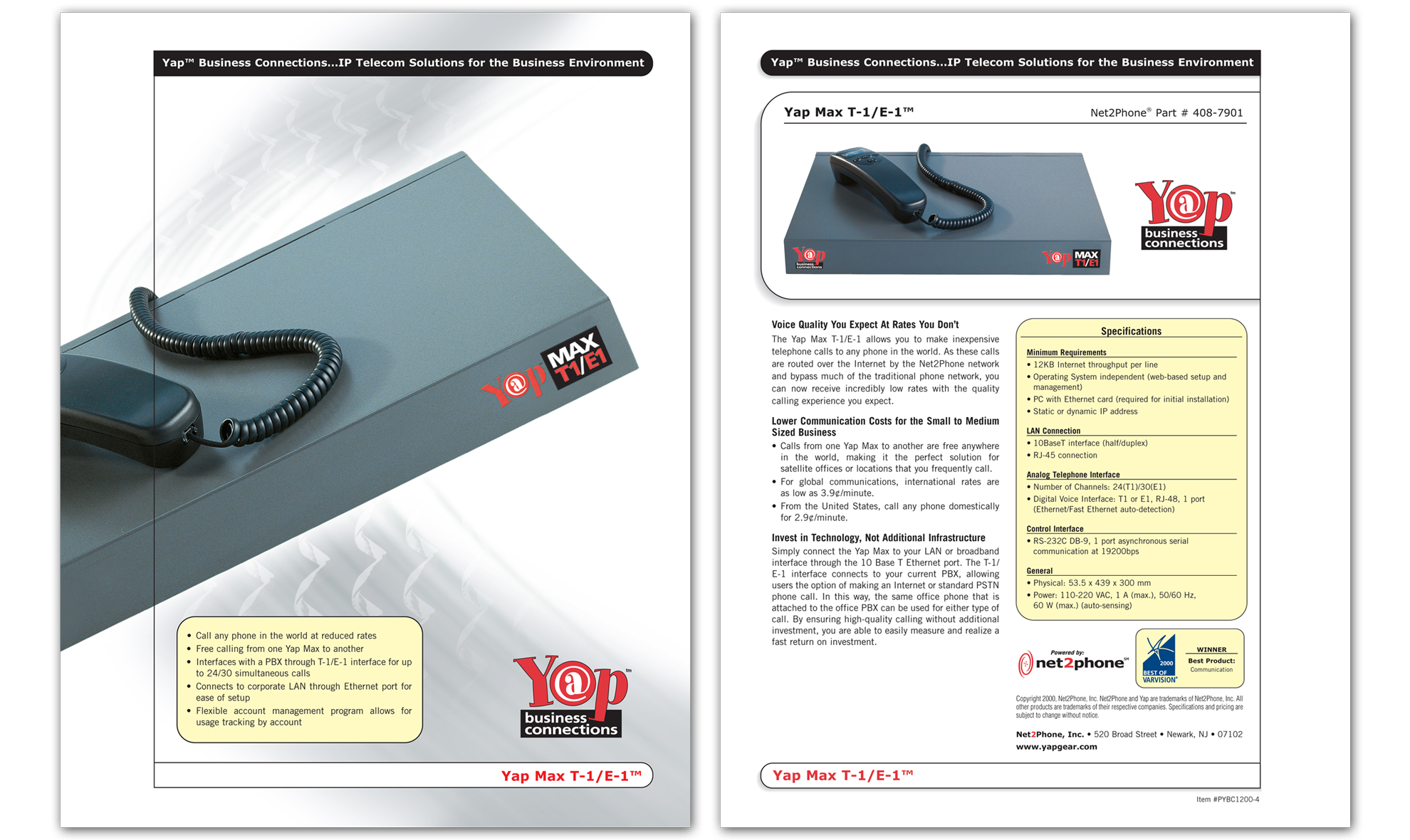
Yap Sell Sheets
Beautiful photography and clean design come together in these visually crisp, smart sell sheets branding Net2Phone’s new line of high-end ‘Yap’ business VOIP products.


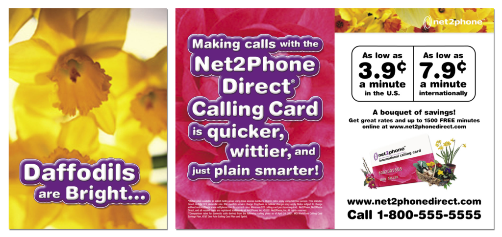
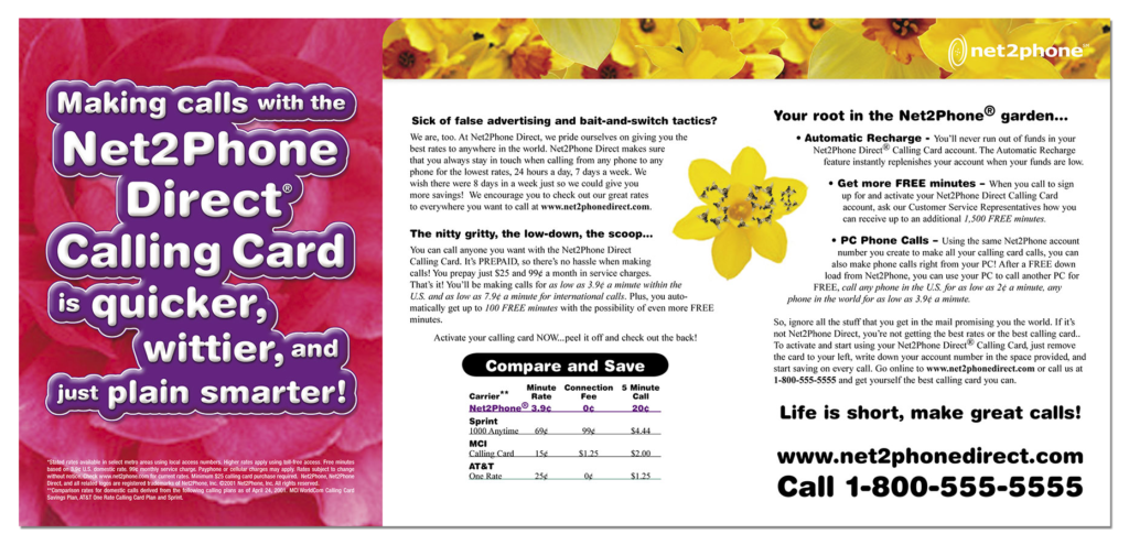
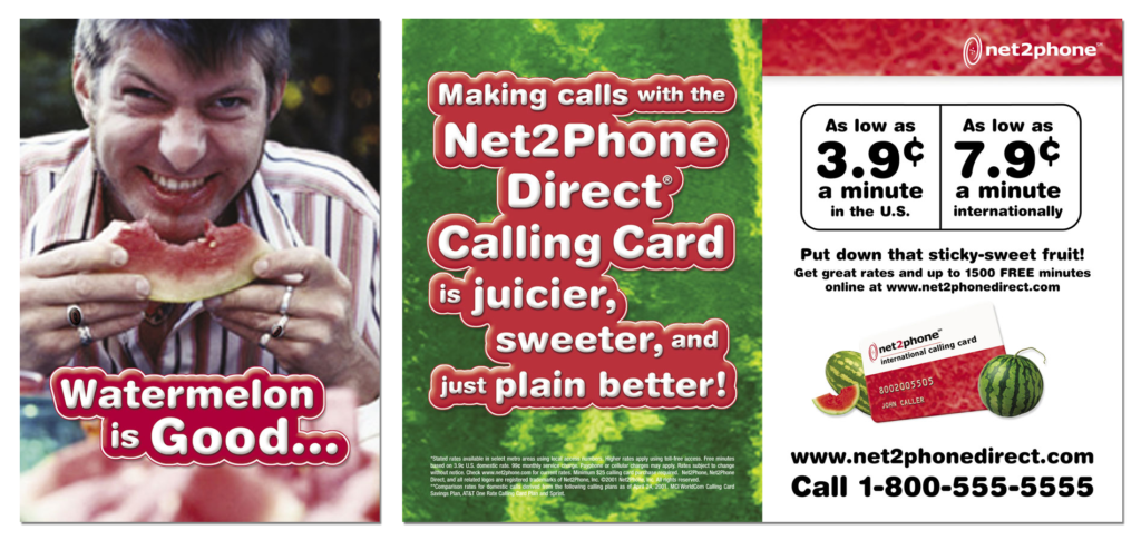
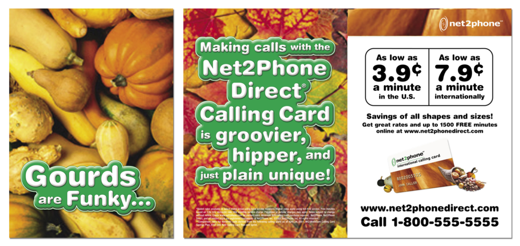
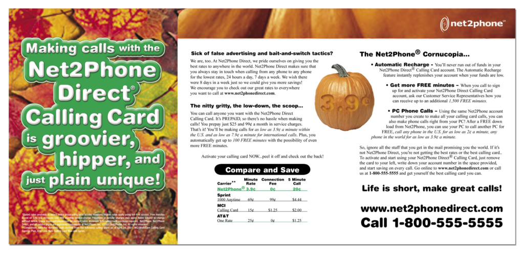
Seasonal Direct Mail Campaign
These seasonal direct mail trifold brochures were humorously designed and written to illicit a positive experience for recipients. Covers consist of a bizarre statement to pique the recipient’s curiosity. A fun sales pitch awaits inside. Calling cards were tipped into each brochure, on top the comparative rate chart.