Description
In early 2000, Angry Bitter Happy Records approached me to design new logos and collateral for their new record label and recording studio, Hole in the Wall Studios. They loved the work I did so much that I also created promotional materials for one of their bands.
Roles
Art Director
Graphic Designer
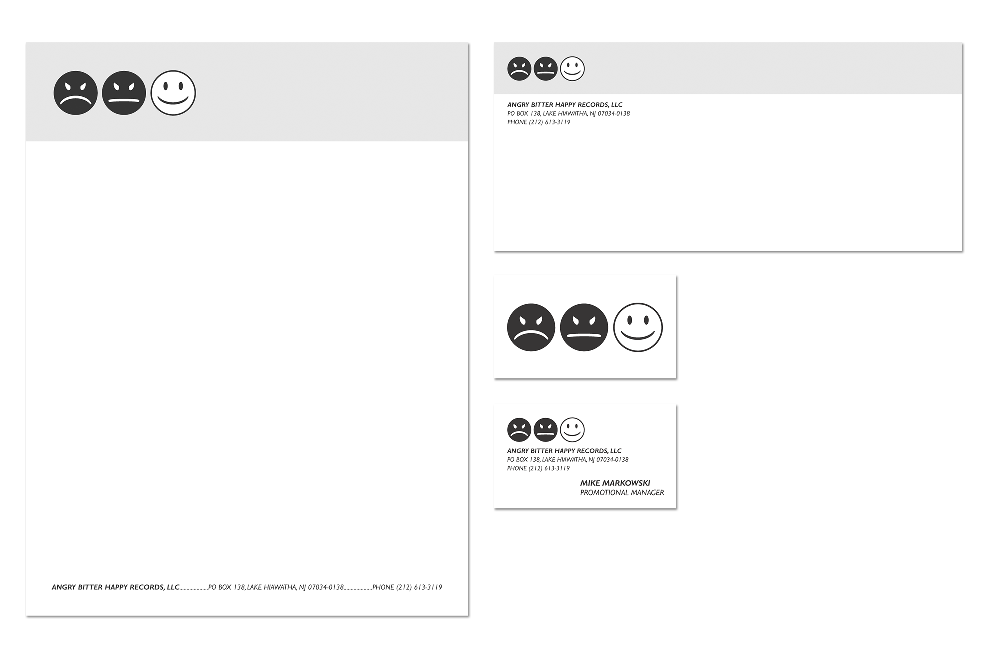
Angry Bitter Happy Records
Before emojis were really a thing, three simple faces immediately came to mind when I read the name of the label — angry, bitter, and happy. While the angry and bitter faces appear gloomy and black, they lead to the ironic and bright happy face. It was a wonderful solution that could be easily recognized from the spine of a CD jacket.
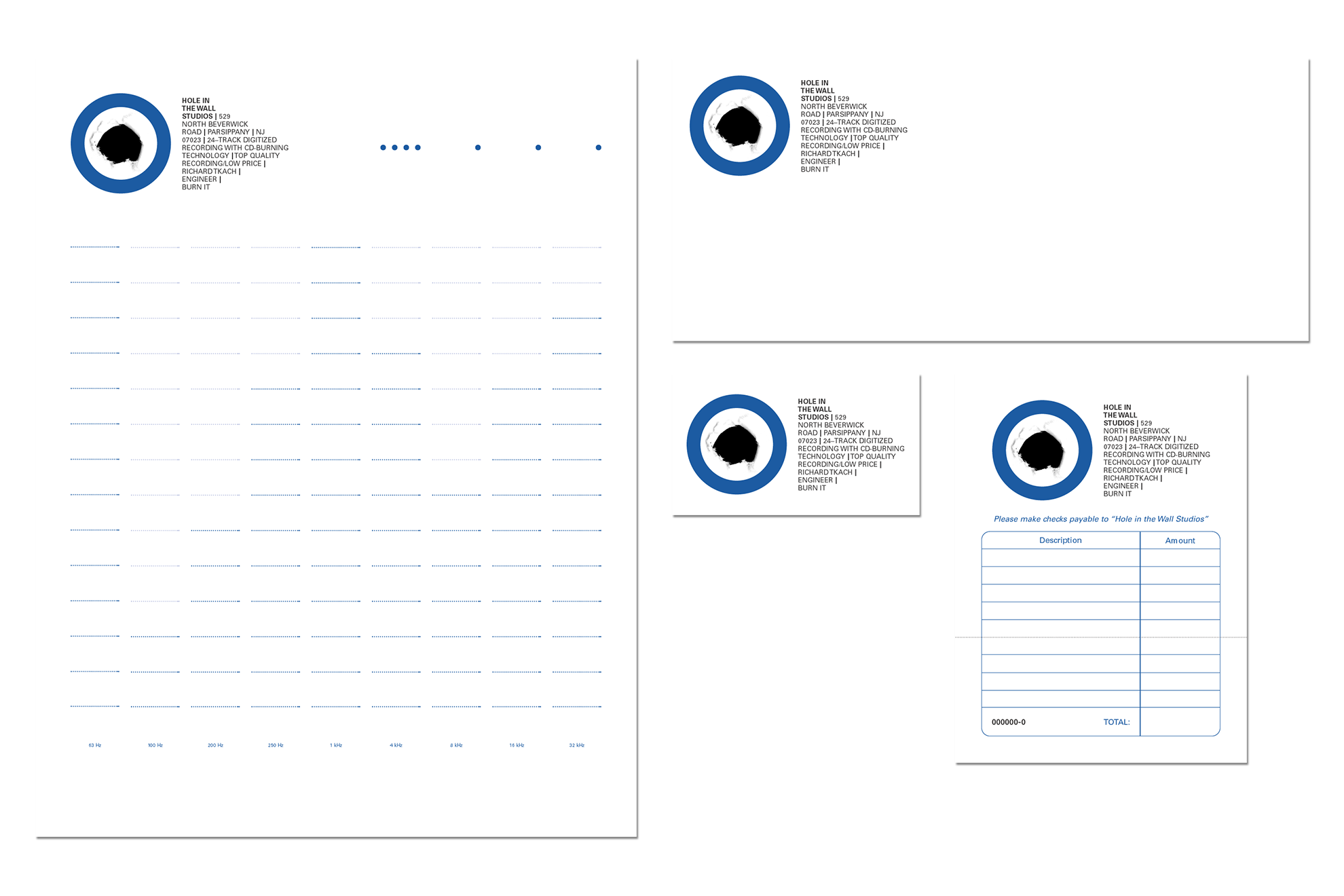
Hole in the Wall Studios
The Hole in the Wall Studios logo and copy block combine to form a ‘record’ symbol. A thick, graphic circle surrounds a crude, visceral hole while a copy block containing vital information about the business utilizes line breaks to form a triangular shape (referencing a ‘play’ symbol). Recording equipment at that time used these two combined symbols (a circle and a play symbol) on record buttons. Guidelines for handwriting on the letterhead reference digital graphic equalizer displays.
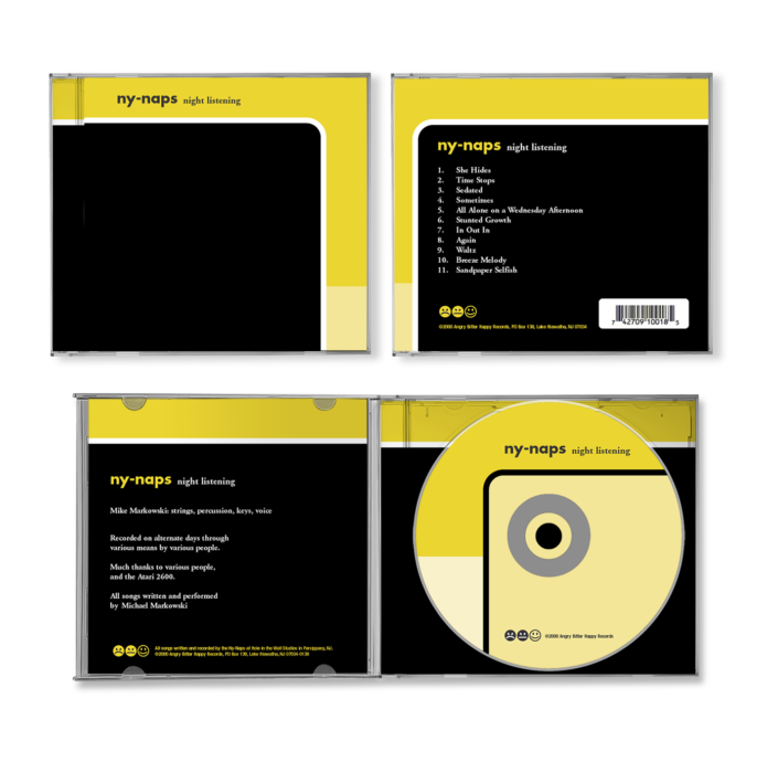
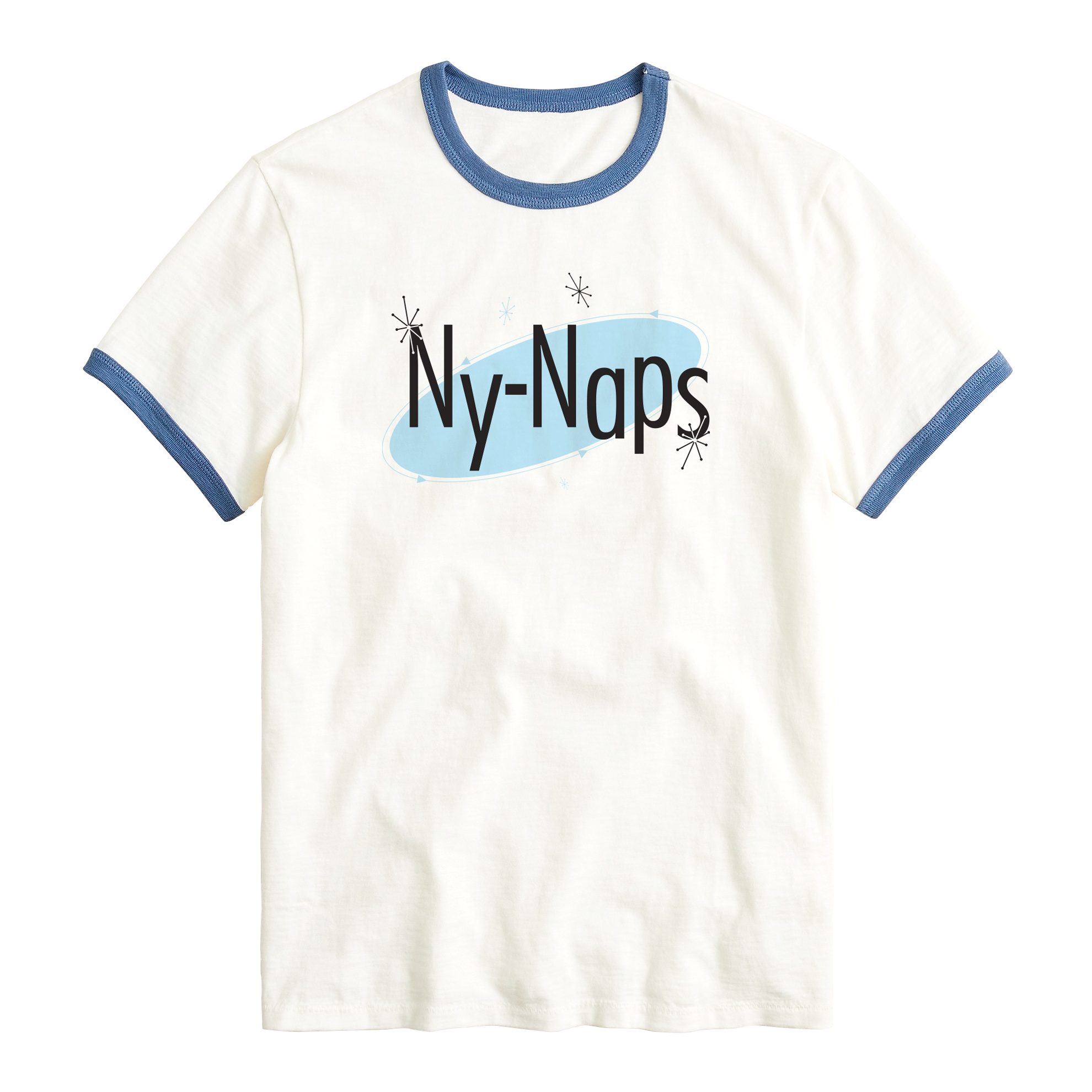
Ny-Naps
Jazz and blues albums from the 1950s and 1960s were the inspiration for this CD jacket and t-shirt design for one of the label’s first artists. The smooth, graphic lines and shapes in different tints of mustard yellow and black reflected the band’s mellow music while the bouncy t-shirt logo, complete with stars and farkles, presents an ironic twist in the form of a 1950s advertisement. The client sold out of both items.