Description
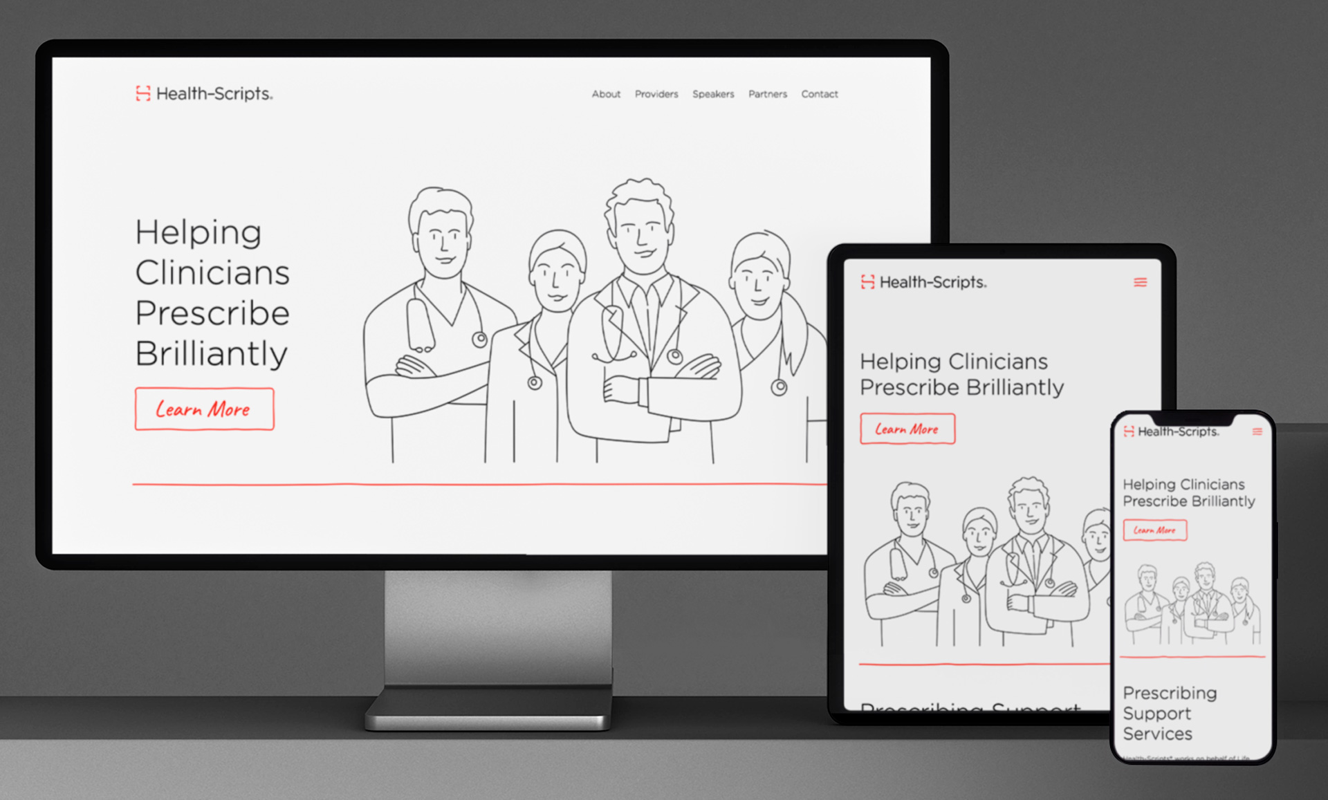
In early 2023 I rebranded Health-Scripts, a health media company working on behalf of life sciences to overcome barriers and help clinicians evaluate and access optimal therapies for their patients. The goal for this project was for Health-Scripts to become less clinical and more human, and the resulting clean, light, and relatable identity is just what the doctor ordered. I also developed a bespoke CRM application for program coordinators to aggregate data and help with daily business activities.
Roles
Brand Strategist
Creative Director
UX/UI Designer
Developer
Graphic Designer
Illustrator
Links
Logo
Clean lines form a squared glyph conveying abstracted ‘H’ and ‘S’ letterforms in a singular mark. The center line of the glyph links two expanding arrows and creates a syntactical reference to a path connecting two ever-growing points.


Illustrations
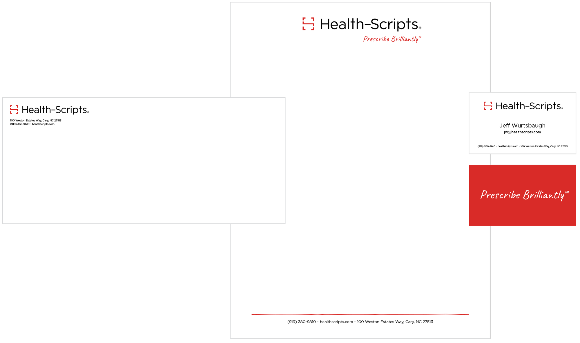
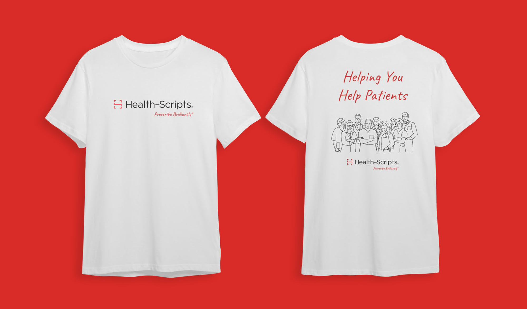
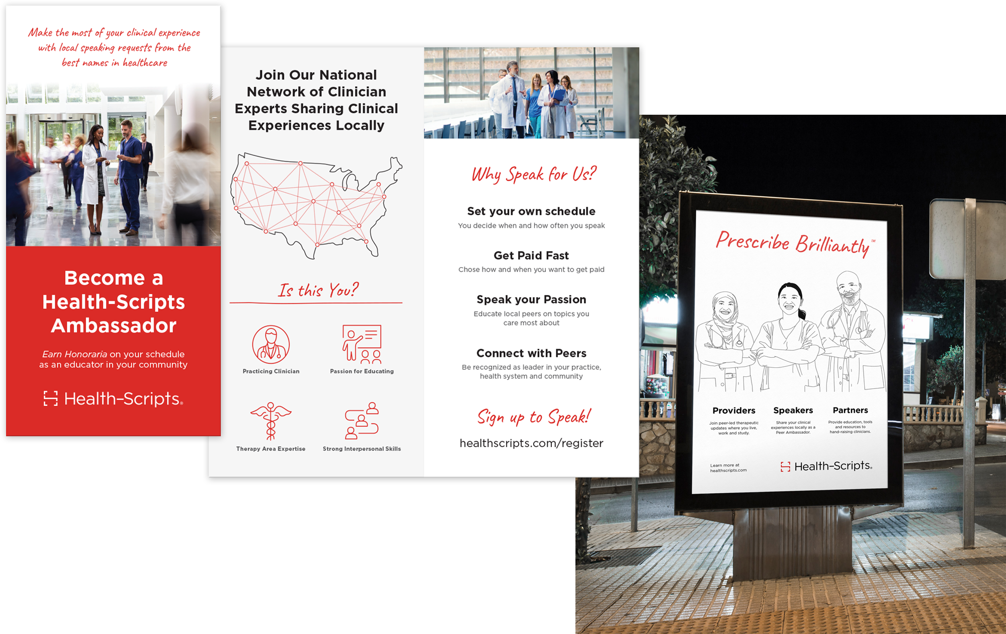
Simple, hand-drawn line illustrations, icons, and identity accents are a key component of the Health-Scripts® identity. They lend a relatable, grass-roots vibe and create a unique dichotomy with the more clinical Health-Scripts® identity elements.
These illustrations are intended for use at a large scale, allowing ample white space for each graphic to live.
Certain elements are filled in the Health-Scripts primary brand color, and convey the various mediums Health- Scripts uses to reach clinicians.
Iconography
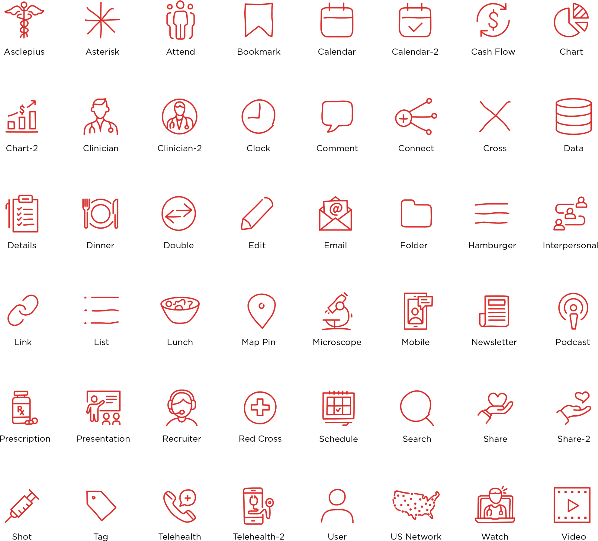
Hand-rendered, imperfect healthcare related line icons bring this cohesive identity together with a human touch.
Photography
Immersive macro photography focuses on a bigger picture, emphasizing the world surrounding the clinicians featured. Images convey movement, action, and authentic clinical environments.


Website
I developed a custom WordPress theme with full site editing capabilities, and incorporated hand-rendered SVGs into native elements for ease-of-use (form borders, menu icons, separators, etc).
