Description
In late 2017, Kane Realty Corporation needed a system to manage property websites, so I initiated, developed, and executed a solution. The resulting best-in-class WordPress theme framework, Simple Centers, transformed the digital presence of Kane properties into vital destinations for their patrons.
Roles
UX Designer
UI Designer
WordPress Developer
Links
Foundational Research
Qualitative research included interviews and surveys of users from Kane’s largest property website, North Hills.
Quantitative and behavioral research consisted of analytics from the existing website and provided insights into user flows and feature usage that were vital in updating the information architecture of the new website.
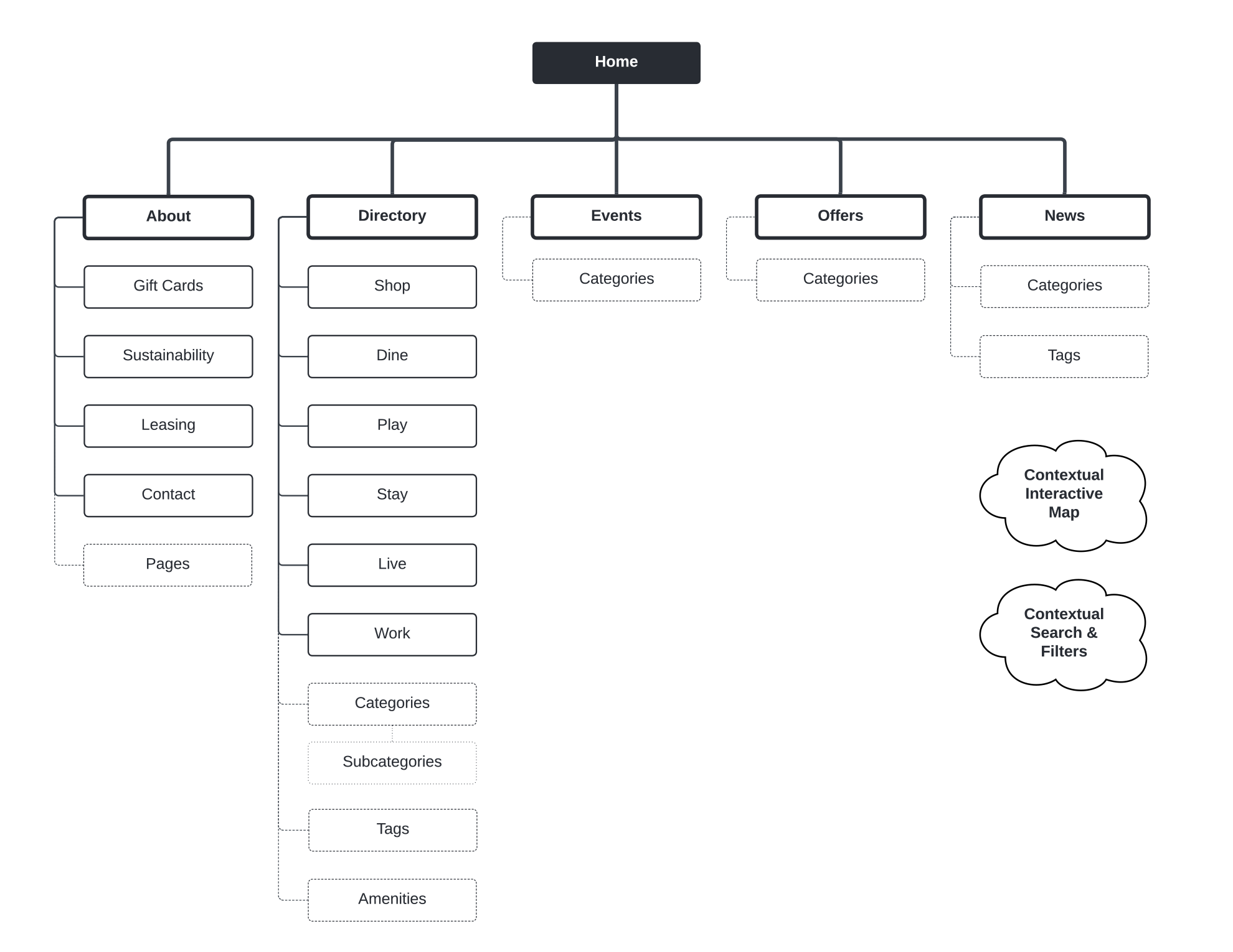
The audience was grouped into three segments:
- Guests — Visitors of the website.
- Managers — Employees who managed the website.
- Partners — Property tenants and stakeholders featured on the website.
Guests
12,000 subscribers to the North Hills email newsletter were surveyed regarding their experience with the website. Five guests were interviewed to collect in-depth opinions, experiences, and thoughts.
Guests despised the website’s inconsistent navigation, which eliminated key navigation links on mobile devices.
Tedious additional page views while attempting to locate restaurants or shops.
Events were not included within main site navigation and it made discovery difficult on mobile.
The property map was not interactive and did not offer the same category filtering options observed on competitor websites.
Slow page load times hindered access from mobile devices, and analytics revealed a high bounce rate.
Analytics revealed that a prominent search feature on every page of the website was used by less than 5% of guests.
Surveys revealed that 72% of subscribers felt the existing site’s content was outdated or boring.
Managers
Five key members of the management team were interviewed, whether or not they had a role in running the website, to better understand their roles and identify potential new features.
Managers were frustrated by limited customization options that made it difficult to showcase recent initiatives and events.
There were no tools to gauge guest interest. Even if identified, managers could not communicate with guests based on their interests.
There was no way to display future projects on the property map to provide guests with information or generate excitement from partners.
Tenants were unable to manage their own profiles, so the management team had to field many requests to update outdated tenant information and add offers to the existing website.
The leasing team was not considered at all, and there were no tools to showcase available spaces.
The operations team was also not considered, and there were no tools to communicate threats, road closures, or openings on a property wide scale.
Partners
Five tenants and five sponsors from the North Hills property were interviewed to determine possible features and partnerships.
Partners were frustrated by their inability to collaborate on the website, and they did not feel valued.
Tenants could not update their own directory profiles and add events or offers. Tenants had to request and wait for management to make updates.
Tenants could not engage with their customers through the website in a meaningful way.
Sponsors were offered guest blog posts and special event listings on the website as part of their contracts, but their posts were difficult to find or were not prominently featured.
Interpretation
UX research spotlighted many pain points with the existing website and pointed to four key goals to elevate the North Hills website experience for guests, managers, and partners.
- Drive engagement. Guests were bored with the website, and partners could not make updates to reach their customers. We needed to foster community to create something bigger.
- Build better tools. Managers needed components and admin tools to create dynamic layouts and provide guests with dynamic information.
- Simplify journeys. Four or five clicks was far too many to simply locate a restaurant. Vital information needed to be surfaced.
- Use the latest web standards. This website was losing guests with janky mobile display issues and slow page loads. Without SSL, bot traffic was also a huge problem, and made analytics data unreliable.
Ideation
Collaboration was a key element of the ideation process. Solutions were brainstormed with cross functional teams to address the website’s pain points.
- Connect partners and guests. Provide them with login access to the website. Guests could select their favorite places with like buttons on directory profiles and receive notifications when those places post sales or events. Partners could have a direct channel with engaged guests.
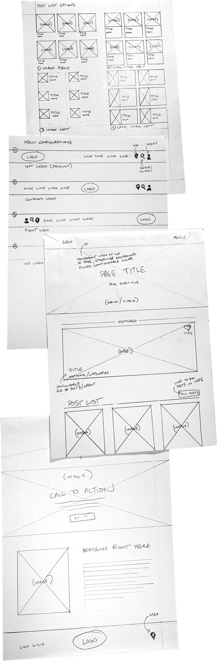
- Create customizable components. Navigation, post lists, page layouts, featured post components, an interactive map, leasing information, and many more. These components become vital tools to dynamically feature news and information.
- Audit existing information and copy. Segment by categories and subcategories. These segments inform the parent/child relationships and custom taxonomies necessary to help guests find what they need.
- Update the tech stack. The latest version of Bootstrap to ensure the website is semantic, fully responsive, and quick-to-market. Icon libraries, plugins, and many other integrations were considered.
UX Choices
Navigation
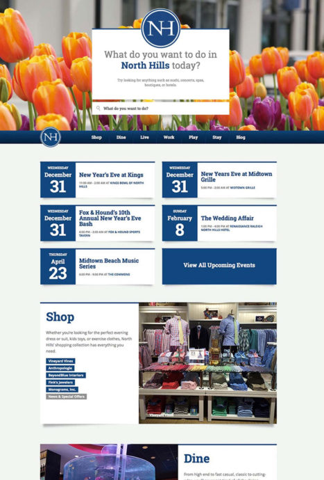
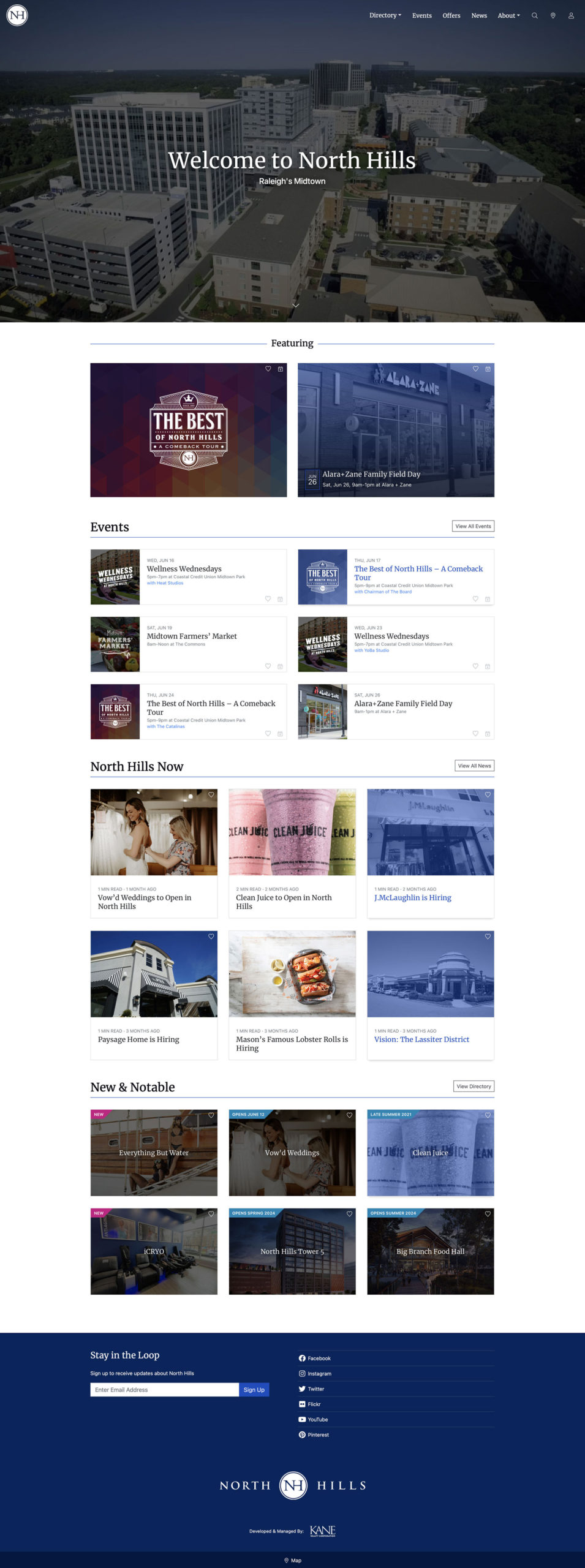
An interactive, fixed navigation bar addressed issues from the previous site. When guests scrolled down the page, the main menu was hidden, but returned instantly as they scrolled up. This fixed navbar provided instant access without taking up valuable screen space on mobile devices.
Links, a search feature (now with decreased prominence), category filters, and sorting options were all integrated in navigation bar, allowing visitors to quickly reach all features without having to scroll back to the top of the page.
Components
Dynamic components offered video, vibrant images, and animated elements and were built with admin customization options to allow quick updates to pages, add featured content, and keep dynamic layouts easy to maintain without options bloat. This solution predated the current WordPress block editor and utilized custom metadata, metaboxes and fields built with CMB2.
Tools
Tools to add post lists allowed managers to quickly add content to any page, post, or taxonomy archive. Anywhere. Post lists also include global customization options which allowed managers to differentiate and style post lists for each post type.
Images
Responsive images were loaded based on device size, using Picturefill.js, and improved performance on mobile. This solution predated the current responsive image solution now offered by WordPress.
Design & Development
Integrations
Many custom solutions were built using a mix of Vanilla Javascript, jQuery, CSS, and PHP. Custom solutions included a branded login page and signup form, a frontend guest dashboard, and a branded email communications system for automated emails. Integrations included a MailChimp newsletter sign up form with admin management interface, CMB2 for custom admin management pages, a Laravel templating system, Google reCAPTCHA security for forms processing, Twilio for text messaging, Mailgun for email, FontAwesome for icons, and Google Maps for the interactive map.
Management
A new communications channel allowed property management to display and send alerts to tenants, partners, and guests. Colorized by threat level (information, warning, and danger), alerts were displayed across all pages of the website, and communicated via text message/email to those who opted into the service.
In addition, the property management could list locations as “available for lease” and quickly create online flyers with location-specific information, including square footage, brochures, floor plans, and more.
Community
This framework allowed guests and partners to log into the website.
- Partners could integrate social media accounts, edit their own directory profiles, and add events/news/offers (subject to approval by management).
- Guests could manage communication preferences and engage with the community.
- Managers could leverage stakeholders to help keep the website buzzing with activity.
A like button system allowed guests to select places that piqued their interest with the click of a button, and opt-in to received notifications from places they like.
Management and partners could notify these guests with automated text messages and branded email communications simply by posting offers, events or news to the website.
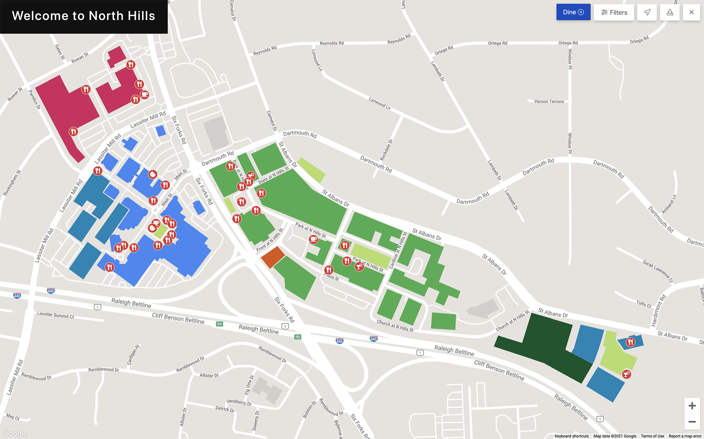
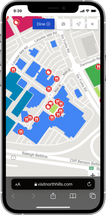
Interactive Map
The interactive map geolocated every aspect of the property in the admin dashboard as well as on the front end of the site. Management could differentiate between locations and create parent/child relationships:
- Draw and colorize buildings, districts, garages, and attractions on maps, with limitless customizations.
- Add future or recently constructed locations.
- Segment locations by color and category and add representative icons.
Interactive maps changed context for guests, depending on the page displayed, allowing visitors to quickly find points of interest.
- Single directory location pages displayed that location only.
- Category archives displayed locations from that category only.
- All directory locations were displayed otherwise.
Launch & Beyond
Active between September 2018 to November 2023, the Simple Centers WordPress framework emphasized community and provided a best-in-class experience for guests, partners, and managers.
Several updates to enhance the overall experience and provide more customization for managers were developed and executed over a four year period.
23%
Decreased Bounce Rate
1.54M
Annual Page Views
340k
Unique Annual Visitors